
Blog Template
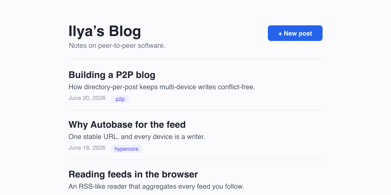
A personal blog you can write from any of your devices. The drive is an Autobase Collaborative Drive, so each Device you add is a Writer of the same drive under one stable hyper:// URL — no follower-breaking key changes. The drive declares itself a walled.garden/feed so the in-browser Reader can subscribe to it.
How it works
Section titled “How it works”/index.jsondeclarestype: "walled.garden/feed"withitemsPath: "/posts/".- Each post is a directory —
/posts/<YYYY-MM-DD-slug>/containing apost.json(walled.garden/post) and apost.mdbody. Co-locate images in the same folder and reference them with relative paths. - The app shell is
/index.html, declared as the manifestfallback: a page navigation with no real file serves the shell, which routes off the URL. - Posts are URL-addressable:
hyper://<blog>/posts/<slug>/is the themed permalink. The post directory has no index file (the body ispost.md), so that navigation misses and thefallbackshell renders the post; the raw body stays directly readable at/posts/<slug>/post.mdon any runtime. - Drafts: tick “Save as draft” to set
draft: true. Drafts sync to your devices and stay out of feeds and readers — but note the drive is public, so a draft is hidden, not secret. - Multi-device: open Devices → Create invite link, open the link on another device, and approve the request. That device can then publish too.
Source
Section titled “Source”<!doctype html><html> <head> <meta charset="utf-8"> <meta name="viewport" content="width=device-width, initial-scale=1"> <link rel="icon" type="image/png" sizes="32x32" href="/thumb"> <title>Blog</title> </head> <body> <blog-app></blog-app> </body> <script type="module" src="/app.js"></script> <style> * { box-sizing: border-box; } body { margin: 0; font-family: system-ui, -apple-system, sans-serif; font-size: 16px; line-height: 1.6; color: #1f2330; background: #fbfbfd; } a { color: #2563eb; } .error { color: #dc2626; padding: 24px; font-family: monospace; }
header.site { max-width: 720px; margin: 0 auto; padding: 40px 24px 8px; display: flex; align-items: baseline; gap: 12px; } header.site h1 { margin: 0; font-size: 26px; font-weight: 700; flex: 1; } header.site h1 a { color: inherit; text-decoration: none; } header.site .desc { display: block; font-size: 14px; font-weight: 400; color: #6b7280; margin-top: 4px; } .toolbar { display: flex; gap: 8px; }
main { max-width: 720px; margin: 0 auto; padding: 16px 24px 80px; }
.post-list { list-style: none; padding: 0; margin: 0; display: flex; flex-direction: column; gap: 4px; } .post-card { display: block; padding: 18px 0; border-bottom: 1px solid #ececf0; text-decoration: none; color: inherit; } .post-card:hover h2 { color: #2563eb; } .post-card h2 { margin: 0 0 4px; font-size: 19px; font-weight: 650; } .post-card .summary { margin: 4px 0 6px; color: #4b5563; font-size: 15px; } .post-meta { color: #9097a3; font-size: 13px; display: flex; gap: 8px; align-items: center; flex-wrap: wrap; } .tag { background: #eef2ff; color: #4f46e5; padding: 1px 7px; border-radius: 99px; font-size: 12px; } .badge-draft { background: #fef3c7; color: #92400e; padding: 1px 7px; border-radius: 4px; font-size: 12px; font-weight: 600; }
article.post .post-title { font-size: 30px; font-weight: 750; margin: 8px 0 6px; line-height: 1.2; } article.post .post-meta { margin-bottom: 24px; } article.post .body { font-size: 17px; } article.post .body img { max-width: 100%; height: auto; border-radius: 6px; } article.post .body pre { background: #f3f4f6; padding: 14px; border-radius: 6px; overflow: auto; } article.post .body code { background: #f3f4f6; padding: 1px 5px; border-radius: 4px; font-size: 90%; } article.post .body pre code { background: none; padding: 0; } article.post .body blockquote { border-left: 3px solid #d1d5db; margin: 0; padding-left: 16px; color: #6b7280; } .body.plain { white-space: pre-wrap; }
a.back { font-size: 14px; text-decoration: none; } a.back:hover { text-decoration: underline; }
.empty { color: #9097a3; font-style: italic; padding: 40px 0; text-align: center; }
form.compose { display: flex; flex-direction: column; gap: 12px; } form.compose label { font-size: 13px; font-weight: 600; color: #374151; } form.compose input, form.compose textarea { width: 100%; border: 1px solid #d1d5db; border-radius: 6px; padding: 10px 12px; font-size: 15px; font-family: inherit; } form.compose textarea { min-height: 320px; resize: vertical; font-family: ui-monospace, SFMono-Regular, Menlo, monospace; font-size: 14px; line-height: 1.55; } .row { display: flex; gap: 16px; align-items: center; } .row label.inline { display: flex; align-items: center; gap: 6px; font-weight: 400; }
.btn { border: 1px solid #d1d5db; background: #fff; border-radius: 6px; padding: 8px 14px; cursor: pointer; font-size: 14px; color: #1f2330; } .btn:hover { border-color: #9ca3af; } .btn-primary { background: #2563eb; color: #fff; border-color: #2563eb; } .btn-primary:hover { background: #1d4ed8; } .btn-danger { background: #fff; color: #dc2626; border-color: #f0b4b4; }
.panel { border: 1px solid #e5e7eb; border-radius: 8px; padding: 18px; background: #fff; } .panel h3 { margin: 0 0 10px; font-size: 14px; } .row-item { display: flex; align-items: center; gap: 10px; padding: 8px 0; border-bottom: 1px solid #f1f2f4; font-size: 14px; } .row-item:last-child { border-bottom: 0; } .row-item .spacer { flex: 1; } .muted { color: #6b7280; font-size: 13px; } code.inline { background: #f3f4f6; padding: 1px 6px; border-radius: 4px; font-size: 13px; word-break: break-all; } </style></html>{ "title": "My Blog", "type": "walled.garden/feed", "fallback": "/index.html", "collaborative": true, "description": "A peer-to-peer blog.", "itemsPath": "/posts/", "itemType": "walled.garden/post", "language": "en"}// Blog template — a walled.garden/feed published as an Autobase Collaborative Drive.// All of your Devices are Writers of one drive under a single stable URL.// Posts are directory-per-post: /posts/<YYYY-MM-DD-slug>/{post.json, post.md}.// Individual posts are URL-addressable at hyper://<blog>/posts/<slug>/ — the directory// has no index file, so that navigation misses and the manifest `fallback` serves this// shell there (the body stays directly readable at /posts/<slug>/post.md).
// This page's own drive + route, from nomad.page — the host-provided page identity, authoritative// on desktop AND mobile (never parse `location` yourself; it's unreliable in the mobile WebView).const BASE = nomad.page.originconst ROUTE = nomad.page.pathconst drive = nomad.fs.drive(BASE)
let state = { view: 'list', // 'list' | 'post' | 'compose' | 'writers' slug: null, info: null, writable: false, myProfileUrl: null, loading: true, requests: [],}
// ── Boot ─────────────────────────────────────────────────────────────────────
customElements.define('blog-app', class extends HTMLElement { async connectedCallback() { try { await boot(this) } catch (err) { this.innerHTML = `<p class="error">Blog error: ${esc(err.message)}</p>` console.error('[blog-app] boot error:', err) } }})
async function boot(el) { state.info = await drive.getInfo() state.writable = !!state.info.writable state.myProfileUrl = await loadProfileUrl()
const route = currentRoute() state.view = route.view state.slug = route.slug state.loading = false
// Live-refresh pending device requests as they arrive (owner only). if (state.writable) { try { drive.watchRequests(async () => { state.requests = await drive.listRequests().catch(() => []) if (state.view === 'writers') await render(el) }) } catch {} }
await render(el)}
// Map the current URL to a base view. Post permalinks are the canonical// /posts/<slug>/ (a directory with no index file — the body is post.md — so the// navigation misses and the `fallback` serves this shell). /p/<slug> is kept as a// legacy matcher for links minted by earlier template versions. Compose/writers// are in-page overlays.function currentRoute() { let p = decodeURIComponent(ROUTE) if (p === '/' || p === '/index.html') { return { view: 'list' } } const m = p.match(/^\/posts\/([^/]+)\/?$/) || p.match(/^\/p\/([^/]+)\/?$/) if (m) return { view: 'post', slug: m[1] } return { view: 'list' }}
// ── Render ───────────────────────────────────────────────────────────────────
function navigate(view) { state.view = view; render(document.querySelector('blog-app')) }
async function render(el) { el.innerHTML = '' if (state.loading) { el.append(h('p', { class: 'empty' }, 'Loading…')); return }
// Tab title tracks the view; renderPost refines it to the post's own title. document.title = state.info?.title || 'Blog'
el.append(renderHeader()) const main = h('main') el.append(main)
if (state.view === 'post') await renderPost(main) else if (state.view === 'compose') renderCompose(main) else if (state.view === 'writers') await renderWriters(main) else await renderList(main)}
function renderHeader() { const hdr = h('header', { class: 'site' }) const title = h('h1', {}, h('a', { href: BASE }, state.info?.title || 'Blog')) if (state.info?.description) title.append(h('span', { class: 'desc' }, state.info.description)) hdr.append(title)
const tools = h('div', { class: 'toolbar' }) if (state.writable && (state.view === 'list')) { tools.append(h('button', { class: 'btn btn-primary', click: () => navigate('compose') }, '✎ New post')) tools.append(h('button', { class: 'btn', click: () => openWriters() }, 'Devices')) } hdr.append(tools) return hdr}
async function renderList(main) { let posts try { posts = await loadPosts() } catch (err) { main.append(h('p', { class: 'error' }, 'Could not load posts: ' + esc(err.message))); return }
// Non-writers never see drafts. if (!state.writable) posts = posts.filter(p => !p.draft)
if (!posts.length) { main.append(h('p', { class: 'empty' }, state.writable ? 'No posts yet — write your first one.' : 'No posts yet.')) return }
const ul = h('ul', { class: 'post-list' }) for (const post of posts) { const card = h('a', { class: 'post-card', href: `${BASE}posts/${post._slug}/` }) card.append(h('h2', {}, post.title || post._slug)) if (post.summary) card.append(h('p', { class: 'summary' }, post.summary)) const meta = h('div', { class: 'post-meta' }) if (post.draft) meta.append(h('span', { class: 'badge-draft' }, 'Draft')) meta.append(h('span', {}, formatDate(post.createdAt))) for (const t of (post.tags || [])) meta.append(h('span', { class: 'tag' }, t)) card.append(meta) ul.append(card) } main.append(ul)}
async function renderPost(main) { main.append(h('a', { class: 'back', href: BASE }, '← Back to blog'))
let post try { post = await loadPost(state.slug) } catch { main.append(h('p', { class: 'empty' }, 'Post not found.')); return }
const blogTitle = state.info?.title const postTitle = post.meta.title || state.slug document.title = blogTitle ? `${postTitle} — ${blogTitle}` : postTitle
const article = h('article', { class: 'post' }) if (post.meta.draft) article.append(h('div', { class: 'post-meta' }, h('span', { class: 'badge-draft' }, 'Draft'))) article.append(h('h1', { class: 'post-title' }, post.meta.title || state.slug))
const meta = h('div', { class: 'post-meta' }) meta.append(h('span', {}, formatDate(post.meta.createdAt))) if (post.meta.updatedAt && post.meta.updatedAt !== post.meta.createdAt) { meta.append(h('span', {}, '· updated ' + formatDate(post.meta.updatedAt))) } for (const t of (post.meta.tags || [])) meta.append(h('span', { class: 'tag' }, t)) article.append(meta)
article.append(await renderBody(post.body, post.kind)) main.append(article)}
function renderCompose(main) { const form = h('form', { class: 'compose', submit: onPublish }) form.append(h('a', { class: 'back', href: '#', click: (e) => { e.preventDefault(); navigate('list') } }, '← Cancel')) form.append(h('label', {}, 'Title')) form.append(h('input', { name: 'title', placeholder: 'Post title', required: true })) form.append(h('label', {}, 'Summary (shown in feeds & readers)')) form.append(h('input', { name: 'summary', placeholder: 'A short teaser', maxlength: '560' })) form.append(h('label', {}, 'Tags (comma-separated)')) form.append(h('input', { name: 'tags', placeholder: 'p2p, hypercore' })) form.append(h('label', {}, 'Body (Markdown)')) form.append(h('textarea', { name: 'body', placeholder: '# Hello\n\nWrite your post in **Markdown**…', required: true })) const row = h('div', { class: 'row' }) row.append(h('button', { type: 'submit', class: 'btn btn-primary' }, 'Publish')) row.append(h('label', { class: 'inline' }, h('input', { type: 'checkbox', name: 'draft' }), 'Save as draft')) form.append(row) main.append(form)}
async function renderWriters(main) { main.append(h('a', { class: 'back', href: '#', click: (e) => { e.preventDefault(); navigate('list') } }, '← Back'))
const writers = await drive.listWriters().catch(() => []) const requests = await drive.listRequests().catch(() => []) state.requests = requests const myWriterKey = (writers.find(w => w.profileUrl && w.profileUrl === state.myProfileUrl) || writers[0])?.writerKey
const panel = h('div', { class: 'panel' }) panel.append(h('h3', {}, 'Add a device')) panel.append(h('p', { class: 'muted' }, 'Create an invite, open it on your other device, then approve the request here. Each device becomes a writer of this blog.')) panel.append(h('button', { class: 'btn btn-primary', click: createInvite }, 'Create invite link'))
panel.append(h('h3', { style: 'margin-top:18px' }, `Pending requests (${requests.length})`)) if (!requests.length) panel.append(h('p', { class: 'muted' }, 'None.')) for (const req of requests) { const row = h('div', { class: 'row-item' }) row.append(h('code', { class: 'inline' }, (req.writerKey || '').slice(0, 16) + '…')) row.append(h('span', { class: 'spacer' })) row.append(h('button', { class: 'btn btn-primary', click: () => approve(req.writerKey, req.profileUrl) }, 'Approve')) row.append(h('button', { class: 'btn btn-danger', click: () => deny(req.writerKey) }, 'Deny')) panel.append(row) }
panel.append(h('h3', { style: 'margin-top:18px' }, `Devices / writers (${writers.length})`)) for (const w of writers) { const row = h('div', { class: 'row-item' }) row.append(h('code', { class: 'inline' }, (w.writerKey || '').slice(0, 16) + '…')) if (w.writerKey === myWriterKey) row.append(h('span', { class: 'muted' }, ' (this device)')) row.append(h('span', { class: 'spacer' })) if (w.writerKey !== myWriterKey) { row.append(h('button', { class: 'btn btn-danger', click: () => removeWriter(w.writerKey) }, 'Remove')) } panel.append(row) } main.append(panel)}
// ── Data ─────────────────────────────────────────────────────────────────────
// Enumerate posts: list /posts/ (flat, recursive), keep the post.json keys, read// each. Sort newest-first by the date-prefixed slug (no ctime in autobase list).async function loadPosts() { const entries = await drive.list('/posts/').catch(() => []) const keys = entries.map(e => e.key).filter(k => k.endsWith('/post.json')) const posts = [] for (const key of keys) { try { const meta = JSON.parse(await drive.get(key)) meta._slug = key.replace(/^\/posts\//, '').replace(/\/post\.json$/, '') posts.push(meta) } catch {} } posts.sort((a, b) => b._slug.localeCompare(a._slug)) return posts}
async function loadPost(slug) { const meta = JSON.parse(await drive.get(`/posts/${slug}/post.json`)) let body = null, kind = null // post.* is the current body convention; index.* is read for posts written by // earlier template versions (pre-ADR-0009-amendment). for (const [name, k] of [ ['post.md', 'md'], ['post.html', 'html'], ['post.txt', 'txt'], ['index.md', 'md'], ['index.html', 'html'], ['index.txt', 'txt'], ]) { const c = await drive.get(`/posts/${slug}/${name}`).catch(() => null) if (c != null) { body = c; kind = k; break } } if (body == null && meta.body != null) { body = meta.body; kind = 'md' } return { meta, body: body || '', kind: kind || 'txt', slug }}
async function loadProfileUrl() { try { const ab = await nomad.fs.readFile('hyper://private/address-book.json').then(JSON.parse) return ab?.profiles?.[0]?.key ? `hyper://${ab.profiles[0].key}/` : null } catch { return null }}
// ── Actions ──────────────────────────────────────────────────────────────────
async function onPublish(e) { e.preventDefault() const fd = new FormData(e.target) const title = (fd.get('title') || '').trim() const bodyMd = fd.get('body') || '' const summary = (fd.get('summary') || '').trim() const tagsRaw = (fd.get('tags') || '').trim() const draft = fd.get('draft') === 'on' const now = new Date().toISOString()
const post = { type: 'walled.garden/post', title, createdAt: now } if (summary) post.summary = summary if (tagsRaw) post.tags = tagsRaw.split(',').map(sanitizeTag).filter(Boolean) if (draft) post.draft = true if (state.myProfileUrl) post.author = { url: state.myProfileUrl }
const valid = await nomad.schemas.validate('walled.garden/post', post) if (!valid.success) { alert('Could not publish — invalid post:\n' + valid.error); return }
const slug = `${now.slice(0, 10)}-${slugify(title)}` try { await drive.put(`/posts/${slug}/post.json`, JSON.stringify(valid.data, null, 2)) await drive.put(`/posts/${slug}/post.md`, bodyMd) } catch (err) { alert('Publish failed: ' + err.message); return } window.location.href = `${BASE}posts/${slug}/`}
function openWriters() { state.view = 'writers'; render(document.querySelector('blog-app')) }
async function createInvite() { try { const url = await drive.createInvite({ multiUse: true }) await navigator.clipboard.writeText(url).catch(() => {}) alert('Invite link copied to clipboard. Open it on your other device:\n\n' + url) } catch (err) { alert('Could not create invite: ' + err.message) }}
async function approve(writerKey, profileUrl) { await drive.approveRequest(writerKey, { profileUrl }) await render(document.querySelector('blog-app'))}async function deny(writerKey) { if (!confirm('Deny this request?')) return await drive.denyRequest(writerKey) await render(document.querySelector('blog-app'))}async function removeWriter(writerKey) { if (!confirm('Remove this writer? Its posts stay until it stops syncing.')) return await drive.removeWriter(writerKey) await render(document.querySelector('blog-app'))}
// ── Helpers ──────────────────────────────────────────────────────────────────
async function renderBody(body, kind) { const el = h('div', { class: 'body' }) if (kind === 'md' && nomad.markdown && typeof nomad.markdown.toHTML === 'function') { try { el.innerHTML = await nomad.markdown.toHTML(body); return el } catch {} } if (kind === 'html') { el.innerHTML = body; return el } el.classList.add('plain') el.textContent = body return el}
function slugify(s) { return (s || '').toLowerCase().replace(/[^a-z0-9]+/g, '-').replace(/^-+|-+$/g, '').slice(0, 50) || 'post'}
// walled.garden/post tags must match /^[A-Za-z][A-Za-z0-9-_?]*$/function sanitizeTag(t) { return t.trim().replace(/\s+/g, '-').replace(/[^A-Za-z0-9\-_?]/g, '').replace(/^[^A-Za-z]+/, '').slice(0, 100)}
function formatDate(iso) { if (!iso) return '' const d = new Date(iso) if (isNaN(d)) return '' return d.toLocaleDateString(undefined, { year: 'numeric', month: 'long', day: 'numeric' })}
function esc(s) { return String(s == null ? '' : s).replace(/[&<>"]/g, c => ({ '&': '&', '<': '<', '>': '>', '"': '"' }[c])) }
function h(tag, attrs = {}, ...children) { const el = document.createElement(tag) for (const [k, v] of Object.entries(attrs)) { if (typeof v === 'function') el.addEventListener(k, v) else el.setAttribute(k, v) } for (const child of children) { if (child instanceof Node) el.append(child) else if (child != null) el.append(String(child)) } return el}MIT License
Copyright (c) 2020 Blue Link Labs
Permission is hereby granted, free of charge, to any person obtaining a copyof this software and associated documentation files (the "Software"), to dealin the Software without restriction, including without limitation the rightsto use, copy, modify, merge, publish, distribute, sublicense, and/or sellcopies of the Software, and to permit persons to whom the Software isfurnished to do so, subject to the following conditions:
The above copyright notice and this permission notice shall be included in allcopies or substantial portions of the Software.
THE SOFTWARE IS PROVIDED "AS IS", WITHOUT WARRANTY OF ANY KIND, EXPRESS ORIMPLIED, INCLUDING BUT NOT LIMITED TO THE WARRANTIES OF MERCHANTABILITY,FITNESS FOR A PARTICULAR PURPOSE AND NONINFRINGEMENT. IN NO EVENT SHALL THEAUTHORS OR COPYRIGHT HOLDERS BE LIABLE FOR ANY CLAIM, DAMAGES OR OTHERLIABILITY, WHETHER IN AN ACTION OF CONTRACT, TORT OR OTHERWISE, ARISING FROM,OUT OF OR IN CONNECTION WITH THE SOFTWARE OR THE USE OR OTHER DEALINGS IN THESOFTWARE.